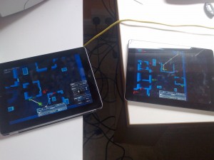
We’ve just talked through some of the test systems we’ll be implementing for the iPad interface.
The point of this is to allow us to:
1.) Check out a bunch of different styles and ideas
2.) Provide enough workarounds for current problems that we can get more into the meat of the UI than we can at present.
I really like this approach because it’s about preventing arguments – many, many UI issues are extremely subjective and easy to misunderstand in abstract. If one person says, “I want a button” and the other says, “I want a slider” , it may actually take less time to implement both and try them than it will to try and thrash that out with a multi-week long argument…although I assume your mileage may vary depending on what your GUI system is like!
Here are some of the things we are thinking of doing:
Tap to select, THEN drag to move
This was Ian’s suggestion to eradicate confusion between objects – this could be a good direction
Keep map movement and unit selection together
I’m very keen on the idea that you can quickly scroll the map around, then choose the unit for which you want to make a plan seamlessly and without modifiers, so we are going to aim for that
“New Waypoint” Handle and Button
We’re going to try two different ways of adding waypoints to a plan.
Orders buttons
The Orders Menu may turn into a more permanent “Xcom-style” set of buttons at the bottom of the screen
Delete button!
There will be a big, prominent button that allows you to delete WP’s and orders - we have this in our current build but it’s a bit hidden.
Time + / – buttons
We won’t be using the time handle system in quite the same way as we do on the PC – there will be a new system for waiting
Playback vs. Planning
As some games do, we may remove the UI during the first run of a turn’s playback so that you can see everything better.
Help overlay
Owing to the lack of screen space we will probably have to break one of my rules about always having descriptive text available within easy reach for a pictorial button – instead of that, we’ll probably have a “question mark icon” help overlay which can pop up over the screen to explain what the hell all the buttons do.
Temporal slider for orders movement
Physically dragging orders around the screen may be too onerous, so we’ll probably have a new UI element which allows you to just move them along a plan using a slider.
Eradicate double-tap
Double tap is currently quite annoying and happens a lot by mistake – hopefully we will get rid of it.
All of that stuff is totally up in the air currently – just thought I would let you know our thinking. I’m really looking forward to actually being able to play the iPad build properly as a game – at the moment it’s kind of impossible.
People have asked me if any UI changes will make it into the PC version – I will be looking at people’s UI issues from the Hotline, Bugs and Wishlist threads at some point next year to see if we want to make any PC-specific changes. Also, if there’s a UI element on iPad that people love, I can’t see why we wouldn’t want to integrate that back into the PC version.
This kind of stage is fairly difficult – you don’t want to under- or over-commit to specific methods, just try to be as objective as possible about potential solutions. Anyway, confidence that we can make a nice robust UI is still high, so we will see how things progress.


